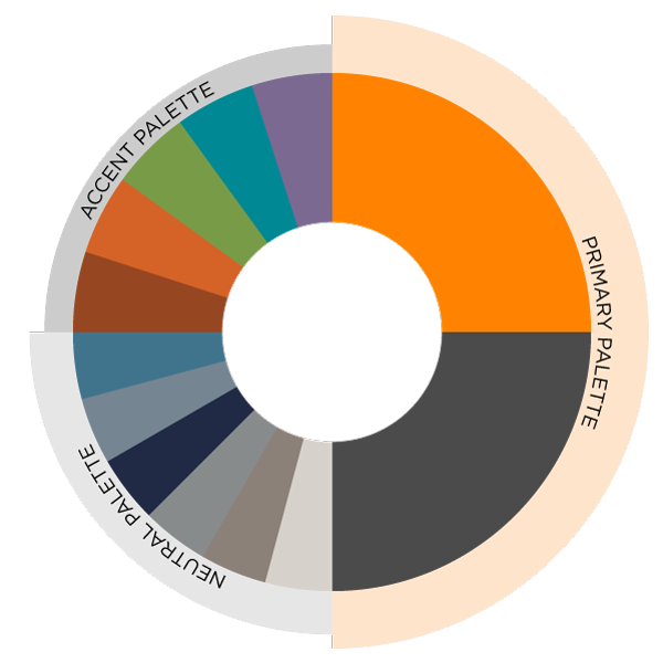
Primary Brand Colors
Instantly recognizable and strongly associated with service to Tennessee, orange is our color — a unifying signifier of the UT’s bold and energetic spirit. We contrast orange with gray, a timeless and adaptable color which provides balance to the primary palette.
Both colors were adapted from the system’s flagship Knoxville campus, and we continue to share ownership of these colors. Tennessee Orange and Smoky Mountain Gray should dominate any piece that tells the story of the UT.
Black is not a color in our palette and should only be used in cases where black and white printing is the only option.
Neutral and Accent Colors
The UT System brand incorporates neutral and accent colors to support its primary color palette without competing with it. Neutral colors were selected to complement designs subtly and may be used at full saturation or as lighter tints. Accent colors are intended to add visual interest, particularly in strokes, design elements and infographics. While primarily used in internal or complex, multi-page communications, these accent colors provide flexibility and variety while maintaining brand consistency.
Color Accessibility
Color is an important asset in visual design, enhancing your message’s aesthetic and emotional impact. However, some people have difficulty perceiving color. In addition, people using text-only, limited-color or monochrome displays and browsers are unable to access digital content presented only in color.
All UT System websites and digital products are designed to meet or exceed the Web Content Accessibility Guidelines (WCAG) 2.2 Level AA compliance — an international standard for usable design.