The primary logo is the preferred visual representation of the UT System. It consists of three elements—the UT icon, wordmark and system identifier. Space, size and background color dictate usage.
Please use the logos exactly as they are—do not crop, change, redraw, rotate or alter the mark in any way. Our downloadable logo files include the required clear space for all logos.
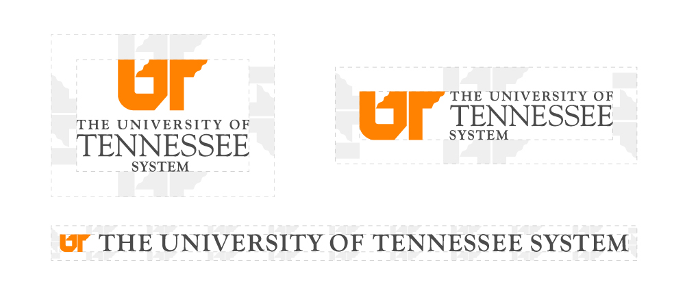
Primary Logo Lockups

Center Aligned
Minimum height is .75 inches or 72 pixels.
Left Aligned
Minimum height is .3125 inches or 36 pixels.

Horizontal – Limited-Use
Minimum height is .25 inches or 24 pixels.
Logo Clear Space
Logo “clear space” refers to the defined area surrounding a logo which should be kept clear of any other elements. This helps ensure maximum visibility, recognition and visual impact of the logo and the brand.
All UT System logos have a clear space equal to 50% of the height of the UT icon.
Logo Color Variations
UT System logos come in three color variations.

Full Color

Reversed

White
In some cases, budget constraints or product limitations may restrict printing or merchandise imprinting to one color. When using a single-color logo, use the following guidelines to determine which color to use:
- Tennessee Orange: use on white, dark or transparent backgrounds.
- White: use on orange, dark or transparent backgrounds.
- Black: only use this when one-color black and white printing is required.